Images and visuals are a core structural element of any Shopify store. They define how products, collections, and content are displayed across devices, how layouts behave, and how consistently a store renders visually.
Shopify supports multiple image types across a store, including product images, collection images, hero or banner images, blog featured images, logos, and background assets. Each of these has different size expectations, aspect ratio considerations, and file constraints defined by the platform.
This guide is a practical reference to Shopify image sizes by use case. It explains the image dimensions, formats, and limits Shopify supports, and how those images are typically presented across product pages, collection grids, and other parts of a store.
If you’re asking “what size should my Shopify images be?”, this guide provides a clear, up-to-date answer for each image type.
However, defining image sizes is only the first step. Maintaining those standards consistently across an entire catalog is where most merchants face challenges.
TL;DR
For Shopify, the recommended product image size is 2,048 × 2,048 px (1:1 square). Hero and banner images should be 1,920 × 1,080 px (16:9). Collection images are typically 1,024 × 1,024 px. Shopify supports uploads up to 5,000 × 5,000 px with a 20 MB file size limit.
This guide reflects Shopify's current platform specifications as of 2026, verified against Shopify's official media documentation.
Shopify image size requirements (2026)
Shopify defines platform-level image limits that apply across all image types.
Shopify image limits:
Maximum image dimensions: 5,000 × 5,000 pixels
Maximum file size: 20 MB
Minimum product image size for zoom: 800 × 800 pixels
Common square product size: 2,048 × 2,048 pixels
Images larger than 5,000 × 5,000 pixels are automatically resized by Shopify. Aspect ratios are preserved.
These limits define the outer boundaries. Actual display depends on theme layout and image placement.
Shopify image sizes by image type
Different sections of a Shopify store use different containers. Using the correct aspect ratio per placement prevents cropping, layout shifts, and inconsistent rendering.
The table below provides a high-level reference for commonly used image sizes by placement. Each image type is covered in more detail in the sections that follow.
| Image type | Common dimensions | Aspect ratio |
|---|---|---|
| Product image | 2,048 × 2,048 px | 1:1 |
| Collection image | 1,024 × 1,024 px | 1:1 |
| Hero image | 1,920 × 1,080 px | 16:9 |
| Slideshow image | 1,200–2,000 px width | Wide |
| Blog featured image | 1,800 × 1,000 px | Wide |
| Logo | ~200 × 200 px display | 1:1 or horizontal |
| Background image | 1,920 × 1,080 px | 16:9 |
These are common working dimensions, not mandatory requirements. Rendering varies by theme.
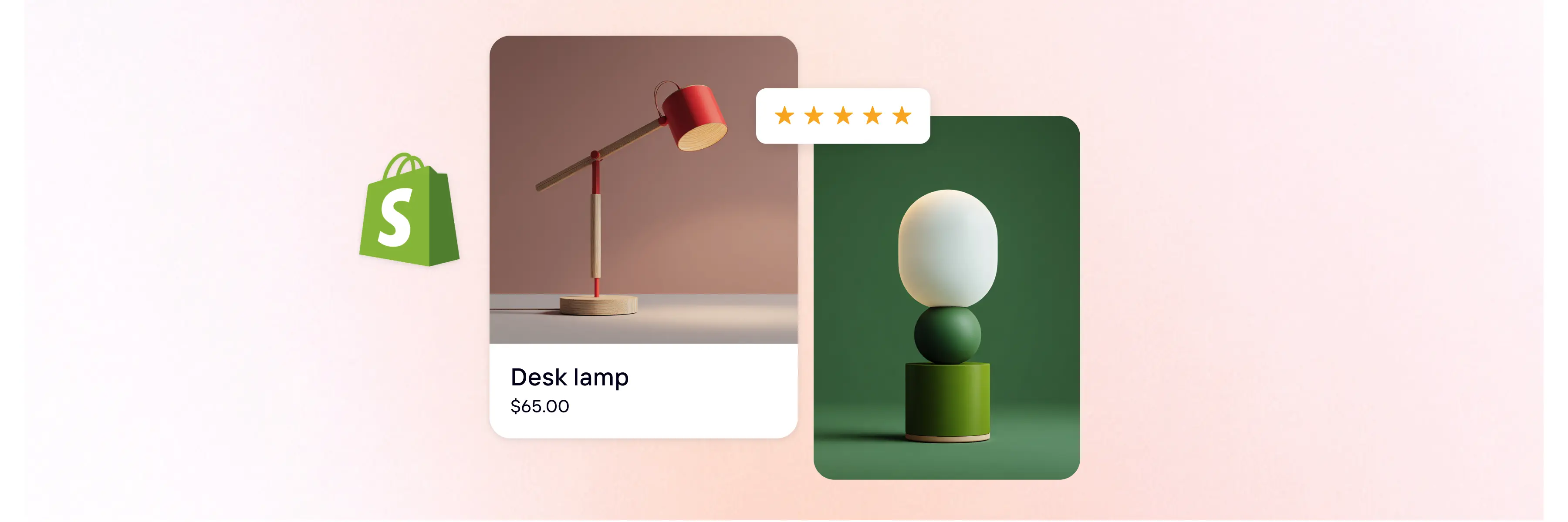
Shopify product image size
Product images appear on product detail pages and support zoom when resolution requirements are met.
Shopify product image specifications (2026):
Maximum dimensions: 5,000 × 5,000 pixels
Recommended working size: 2,048 × 2,048 pixels
Minimum for zoom: 800 × 800 pixels
Maximum file size: 20 MB
Most common aspect ratio: 1:1 (square)
Square product images align cleanly with product grids and gallery thumbnails across most themes.
Shopify collection image size
Collection images represent product groups within category grids.
Common collection image dimensions:
Maximum dimensions: 5,000 × 5,000 pixels
Common working size: 1,024 × 1,024 pixels
Aspect ratio: 1:1 (square)
Maximum file size: 20 MB
Using consistent square ratios ensures stable grid alignment across desktop and mobile layouts.
The Photoroom for Shopify integration helps you defining the dimensions of your collection easily and quickly.
Shopify hero image size
Hero images are wide layout images typically displayed at the top of the homepage.
Common hero image size:
Recommended dimensions: 1,920 × 1,080 pixels
Aspect ratio: 16:9
Supported width range: ~1,280–2,500 pixels
File size: within Shopify’s 20 MB limit
Hero images scale responsively according to the theme’s container width.
Shopify banner and slideshow image size
Slideshow and banner images are used in rotating or wide content sections.
Common slideshow dimensions:
Maximum dimensions: 5,000 × 5,000 pixels
Typical width range: 1,200–2,000 pixels
Typical height range: 400–600 pixels
·Aspect ratio: wide rectangular
Maximum file size: 20 MB
Maintaining identical dimensions across slides prevents layout shifts during transitions.
Shopify blog image size
Shopify blogs use featured images and inline content images.
Blog featured image size
Common dimensions: 1,800 × 1,000 pixels
Aspect ratio: wide rectangular
File size: within 20 MB
Featured images appear at the top of posts and in blog listings.
Inline blog images
Display width: determined by the theme’s content column
Aspect ratio: flexible
Automatically scaled responsively
Shopify logo size
Logos appear in headers and navigation.
Common logo dimensions:
Display size: ~200 × 200 pixels
Aspect ratio: 1:1 (square) or horizontal
File size: lightweight, within Shopify’s 20 MB limit
Themes scale logos based on header configuration and device size.
Shopify background image size
Background images are used in wide layout sections.
Common background image dimensions:
1,920 × 1,080 pixels
Aspect ratio: 16:9
Maximum file size: 20 MB
Background images scale responsively according to section width.
Why image size matters on Shopify?
Images are rendered across different templates, containers, and screen sizes in a Shopify store. Image dimensions and file size influence how quickly pages load, how layouts behave during rendering, and how clearly visual content is displayed.
Performance and loading behavior
Image file size affects how much data a browser needs to download before a page can fully render. Oversized images increase transfer weight, while undersized images may require additional scaling or re-rendering. Choosing appropriate dimensions helps balance image quality with efficient loading across devices.
Read also: How Shopify images influence organic and paid performance
Layout stability and rendering
Shopify themes rely on predefined image containers and aspect ratios. When images do not match these expectations, layouts may shift as images load, or content may be cropped or resized unexpectedly. Consistent image dimensions help themes allocate space correctly and reduce layout shifts during rendering.
Visual clarity across devices
Images are displayed at different resolutions depending on screen size and pixel density. Providing images that meet minimum resolution requirements helps preserve sharpness when images are scaled or zoomed, while maintaining consistent proportions prevents distortion.
Brand consistency across the catalog
In addition to technical rendering, image sizing contributes to visual consistency across product listing pages (PLPs), collection grids, and marketing sections. When aspect ratios and dimensions vary between products, the result is uneven grids, inconsistent cropping, and visual noise.
Maintaining standardized image dimensions across the catalog supports:
Uniform product grids
Clear product recognition
Cohesive brand presentation
On Shopify, image size is part of how a store maintains visual coherence at scale to sell more.
Supported image formats on Shopify
Image format affects how images are encoded, displayed, and delivered across browsers and devices. Shopify supports multiple image formats and may serve optimized versions depending on the viewer’s device and browser capabilities.
The table below lists the image formats supported by Shopify and their typical use cases.
| Format | Typical use | Notes |
|---|---|---|
| JPEG (JPG) | Photographic images | Compressed raster format; widely supported across browsers |
| PNG | Graphics and images requiring transparency | Supports transparent backgrounds; larger file sizes than JPEG |
| WebP | Modern compressed images | Modern format with efficient compression; supported by most modern browsers and good for SEO |
| GIF | Simple animations | Limited color depth; suitable for basic animated visuals |
| SVG | Logos and icons | Resolution-independent; best for simple shapes and line-based graphics |
| TIFF | High-quality source files | Large file sizes; typically used before web optimization |
| BMP | Legacy bitmap | Large file sizes; limited use in web contexts |
| PSD | Design source files | Not web-optimized; must be exported to supported formats for display |
| HEIC | Mobile images | High-quality compression; may be converted for browser compatibility |
Prepare Shopify-ready images
Shopify defines clear size, ratio, and file constraints. The challenge for merchants is not understanding the numbers but applying them consistently across hundreds or thousands of assets.
Product listing pages (PLPs) rely on uniform image dimensions. Collection grids rely on consistent aspect ratios. Hero sections rely on predictable scaling. When image production is inconsistent, layout stability and visual clarity suffer.
The next step is not editing a single image. It is streamlining visual production so that:
Product images follow the same working dimensions
Collection images align with grid ratios
Hero and banner images scale correctly
Assets remain compliant with Shopify’s platform limits
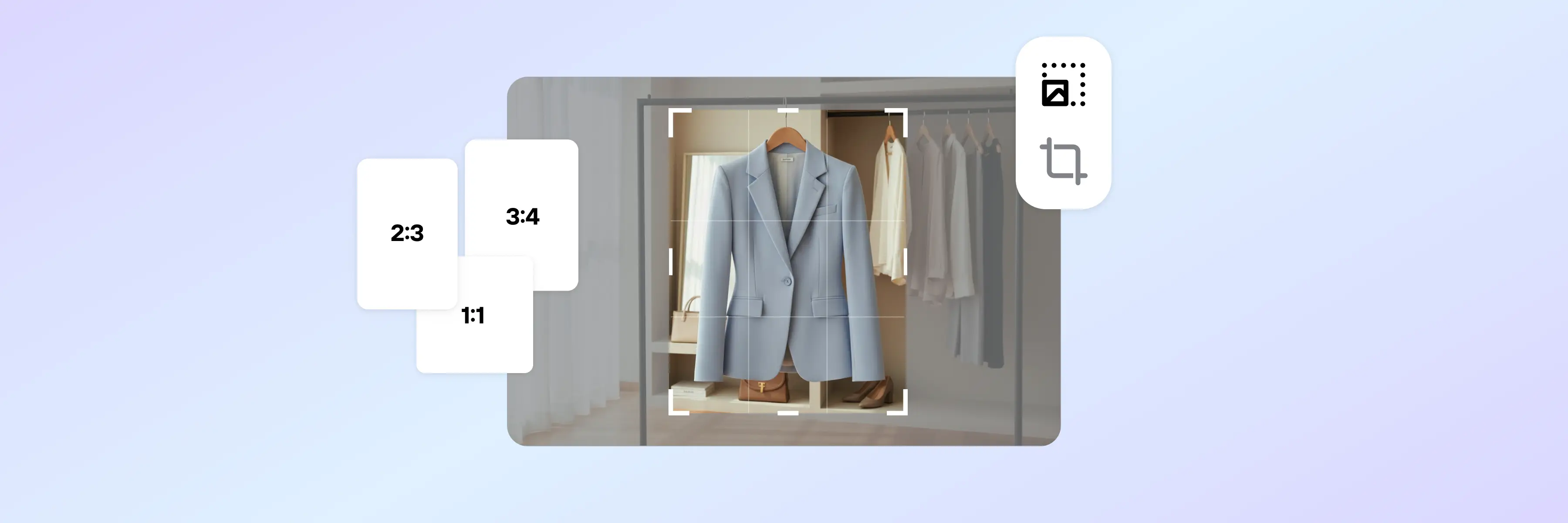
Photoroom lets merchants prepare hundreds of 2,048 × 2,048 px Shopify-ready product images in one session without manual cropping or format conversion.
You can start preparing Shopify-ready visuals today by signing up for Photoroom Web or downloading the app from the Google Play Store or App Store.
Shopify image sizes: FAQs
What is the best image size for Shopify?
There is no single “best” image size for Shopify because different sections of a store use different layouts and aspect ratios. The correct size depends on where the image appears.
As a general reference:
Product images are commonly 2,048 × 2,048 pixels (1:1 square).
Hero and banner images are typically 1,920 × 1,080 pixels (16:9).
Collection images are often 1,024 × 1,024 pixels (1:1 square).
Shopify supports images up to 5,000 × 5,000 pixels, with a maximum file size of 20 MB.
The best size is one that:
Respects Shopify’s platform limits,
Matches the aspect ratio of the section where it appears,
Is applied consistently across similar image types.
Consistency within each image category is more important than using the largest possible dimensions.
How to optimize images for Shopify?
Optimizing images for Shopify means preparing them so they align with platform limits, display correctly across devices, and maintain consistent proportions.
From a technical standpoint, image optimization on Shopify includes:
Keeping dimensions within the 5,000 × 5,000 pixel limit.
Ensuring product images are at least 800 × 800 pixels if zoom functionality is required.
Using consistent aspect ratios for product grids, collection layouts, and banners.
Keeping file size within the 20 MB maximum while avoiding unnecessarily large images.
Using supported formats such as JPEG, PNG, WebP, or SVG depending on image purpose.
Optimization is not only about compression. It is about matching the correct dimensions to the correct placement so Shopify themes can display images predictably across desktop and mobile environments.
How do I make an image fit correctly on Shopify?
An image fits correctly on Shopify when its dimensions and aspect ratio match the container where it is displayed.
If an image appears cropped, stretched, or uneven within a grid, it usually means:
The aspect ratio does not match the theme’s layout,
The image dimensions vary from other items in the same grid,
Or the image exceeds recommended working dimensions and is being scaled down.
To make images fit consistently:
Standardize dimensions across product images (for example, all 1:1 square).
Use the same aspect ratio for collection thumbnails.
Match hero and banner images to wide formats such as 16:9.
Prepare images before upload so they align with Shopify’s limits and theme structure.
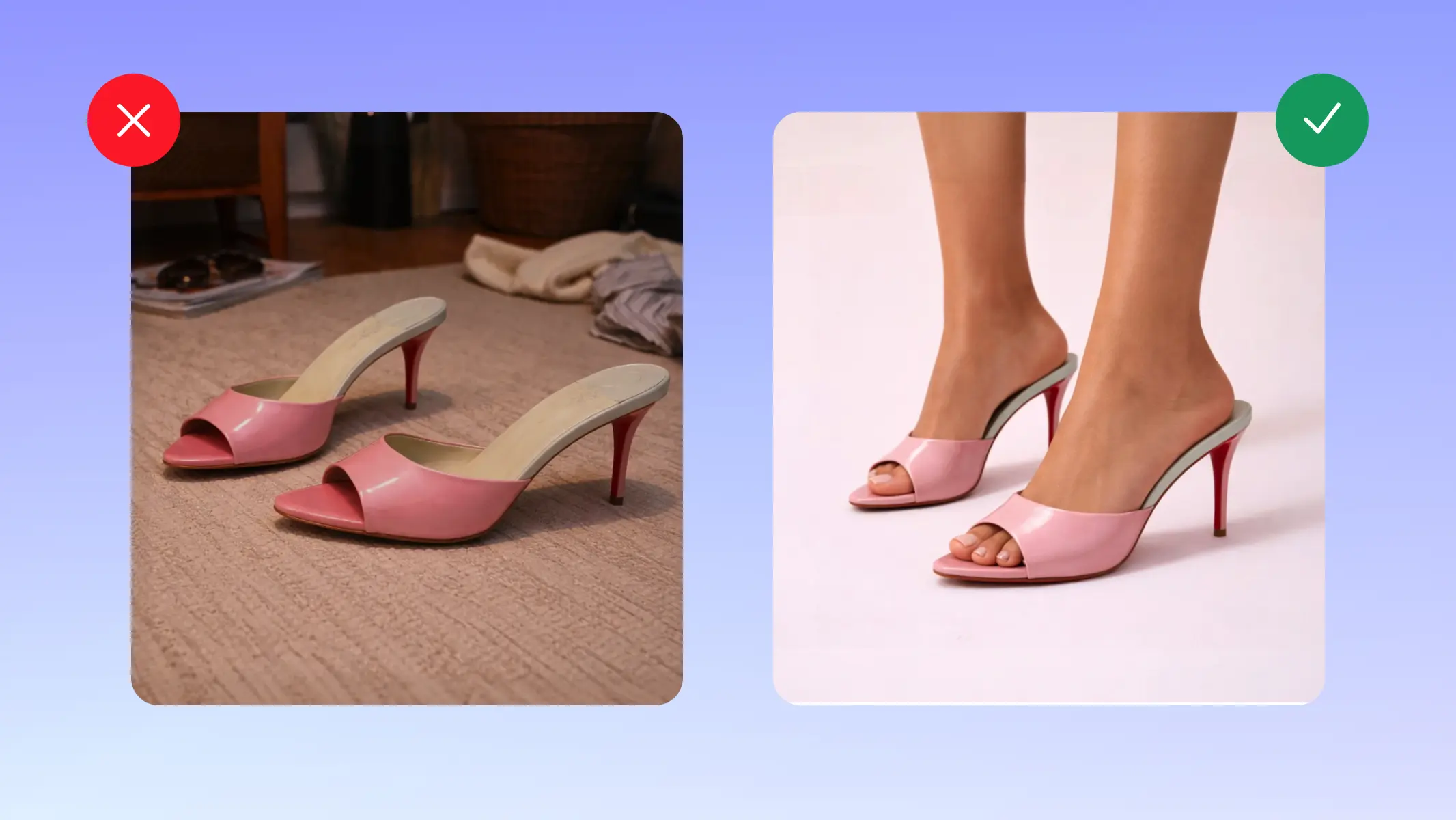
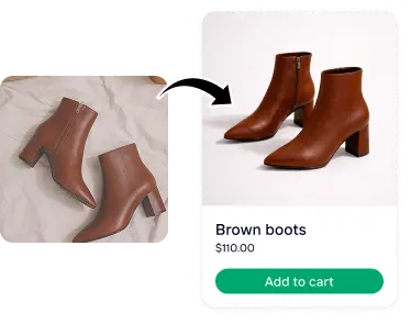
For merchants managing large catalogs, manually adjusting images one by one can create inconsistencies. Tools like Photoroom help standardize and resize images in batches so they align with Shopify requirements while maintaining visual consistency across product listing pages.
What is the best size for a Shopify product image?
The most widely used working size for Shopify product images is 2,048 × 2,048 pixels (1:1 square).
This size:
Provides sufficient resolution for zoom,
Maintains clarity on high-resolution displays,
Aligns well with standard product grid layouts.
Shopify allows product images up to 5,000 × 5,000 pixels, and images must be at least 800 × 800 pixels to enable zoom functionality.
While rectangular product images are supported, square images are most commonly used because they ensure consistent grid alignment across collections and product galleries.
The “best” size is is about using a consistent format that aligns with the theme’s layout and is applied uniformly across the entire catalog.
Does Shopify automatically optimize and compress images?
Yes, Shopify serves images via its CDN and auto-converts to WebP for supported browsers, but this doesn't replace pre-upload optimization.
What is the best image format for Shopify product photos?
JPEG for photographs (smaller file size), PNG for images requiring transparency, WebP for modern browsers (up to 30% smaller than JPEG). Shopify auto-serves WebP where supported.
What is the maximum number of images per Shopify product?
Up to 250 on Basic, 1,000 on Shopify plan, 5,000 on Advanced.
How do I compress images for Shopify without losing quality?
Use lossless or near-lossless tools; Photoroom allows batch resizing and export within Shopify's specs.